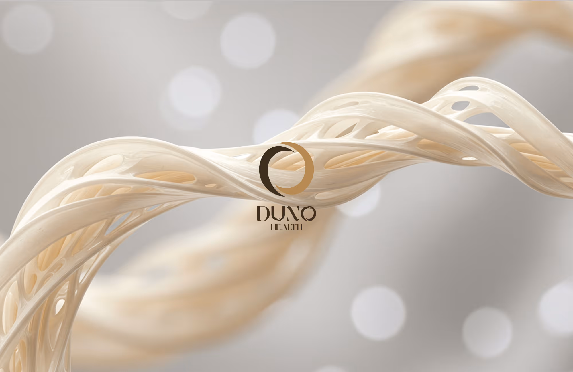
Duno Health
Built for the long game
Client:
Duno Health
Year:
2025
Type:
Strategy
Creative direction
Branding
Packaging

A calm, considered identity for a longevity supplement built for the long game.

Project description
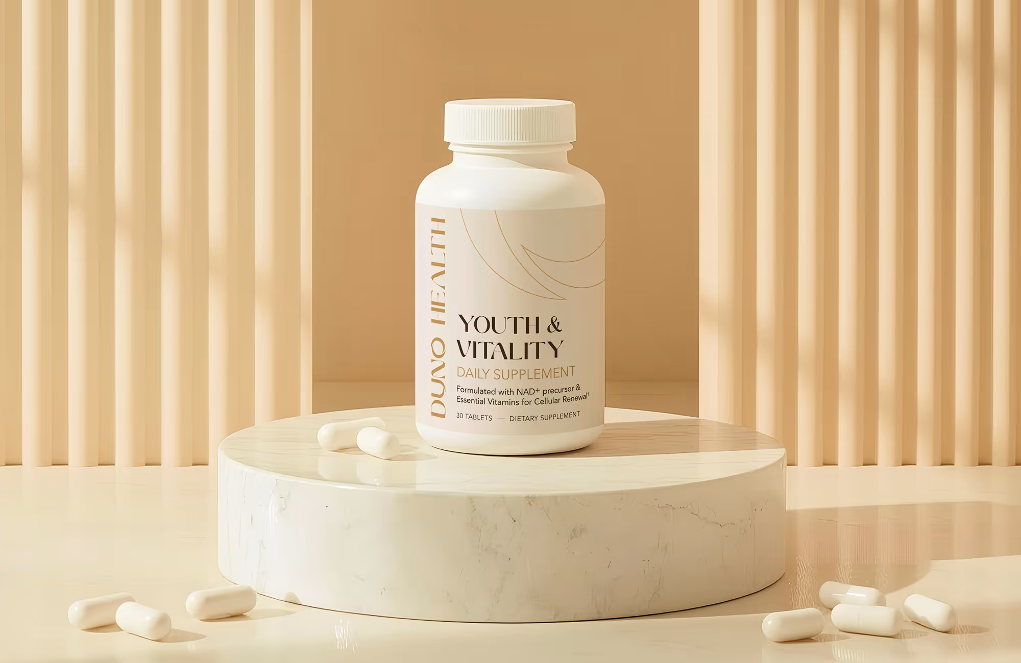
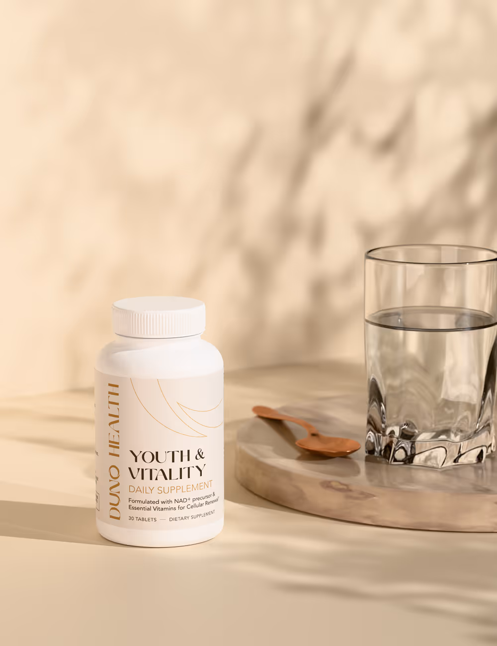
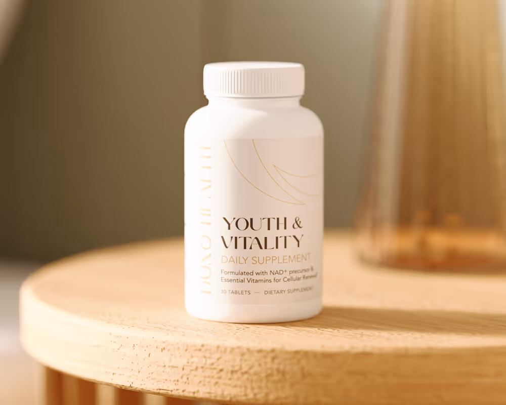
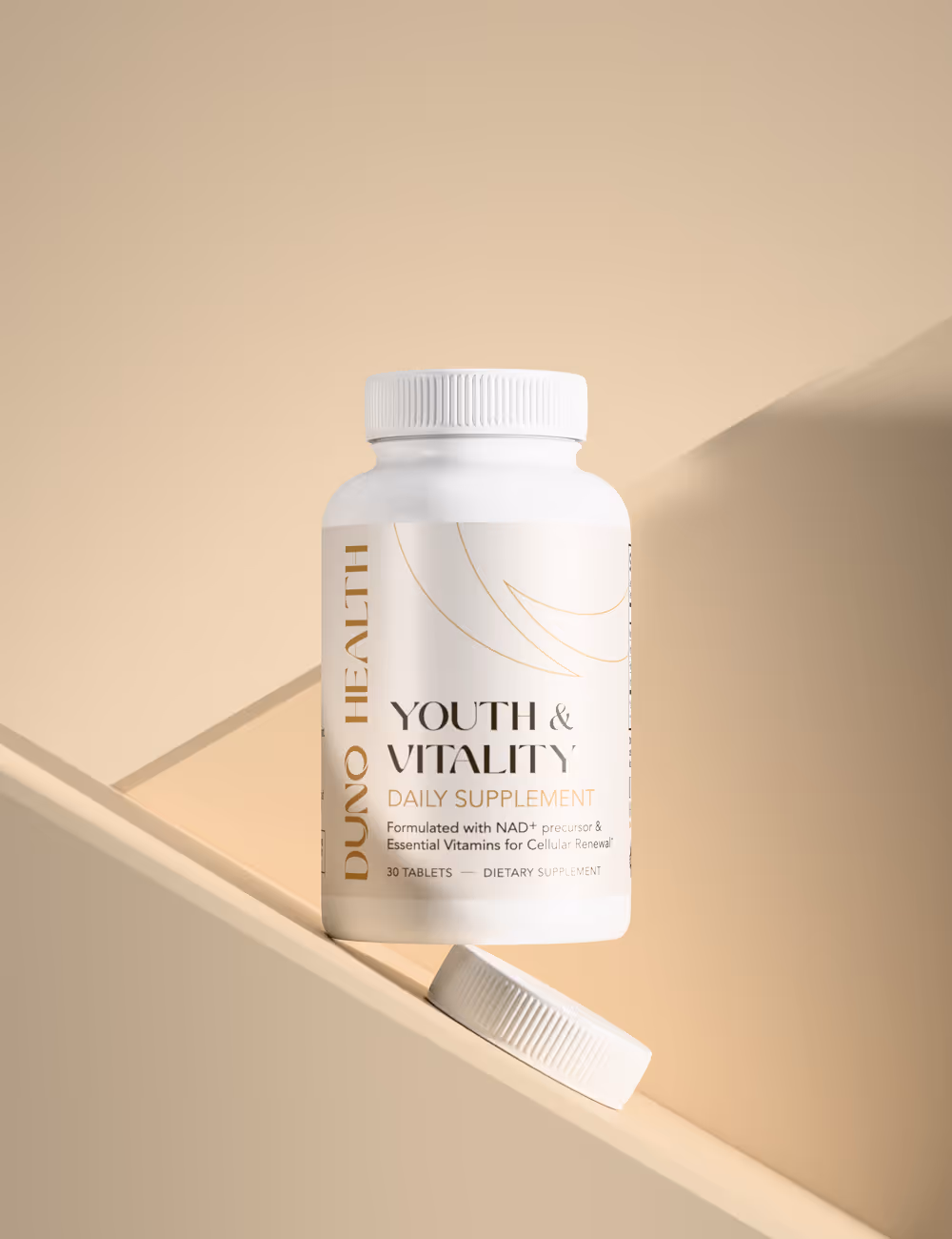
Most supplement brands are built for impulse — bright colors, urgency, hype, and the promise of a result you can feel by next week. Longevity is a different category entirely. The people buying it aren't chasing a workout or a fix; they're making a quiet bet on the next thirty years, and they think about the products they bring into that bet very differently. Duno Health came to us building for exactly that buyer, with a single hero SKU that needed to feel like a long-term commitment from the moment a customer first saw the bottle. The strategic move was to stop competing inside the visual language of short-term supplements altogether.
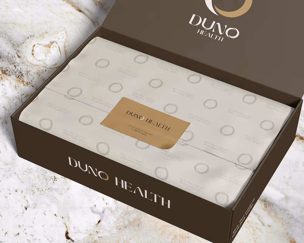
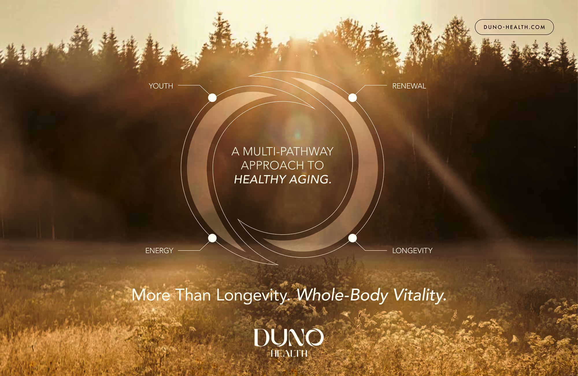
We built a calm, considered identity that reads as durable rather than current — restrained color, thoughtful typography, packaging designed to look as confident on a counter five years from now as on day one. The product visuals carry the same restraint, presenting Duno the way longevity buyers actually think about it: a steady, science-driven object that earns its place in a daily routine. The result is a brand that doesn't sell the moment. It sells the years that follow.
Have a project in mind?
Tell us what you're making. Half-formed idea, full-blown launch, or somewhere in between — we're happy to talk it through.