Creatine Went Mainstream. Now the Branding Is the Battleground.
Creatine isn't a gym-bro supplement anymore — it's a daily wellness staple. And when everyone's selling the exact same molecule, design becomes the only place left to compete.

For decades, creatine lived in one aisle, sold to one audience, in one tone of voice: loud, aggressive, unmistakably bro. That era is over. Creatine has quietly become one of the most mainstream supplements on the market — and the brands still designing for the old audience are about to get left behind.
A category that outgrew its audience
The numbers are hard to ignore. Creatine notched roughly 72% sales growth in the performance category in 2025, and the people buying it look nothing like the traditional customer. The audience has expanded well past male athletes to include women, menopausal and older adults focused on muscle retention, and a wave of wellness users drawn in by emerging research on cognitive benefits. What was a performance ingredient is becoming a daily health habit.
The format is shifting with the audience. Powder still dominates, but creatine is now showing up in stick packs, chews, gummies, and tablets — formats built for convenience and for people who would never own a shaker bottle.
When a category grows this fast, it attracts a flood of new entrants. The market is crowded and getting more so, and analysts increasingly point to differentiation strategy — not formulation — as the thing separating winners from the pack.
When the formula is a commodity
Here's the uncomfortable truth for anyone launching a creatine brand: the product is essentially identical to everyone else's. Creatine monohydrate is creatine monohydrate. You can talk about micronization or purity, but the average buyer can't tell the difference and increasingly doesn't try to.
When the thing inside the tub is a commodity, the brand around it is the entire product. That's not a cynical take — it's just where the competition has moved. Customers aren't choosing between molecules. They're choosing between brands that feel right for them.
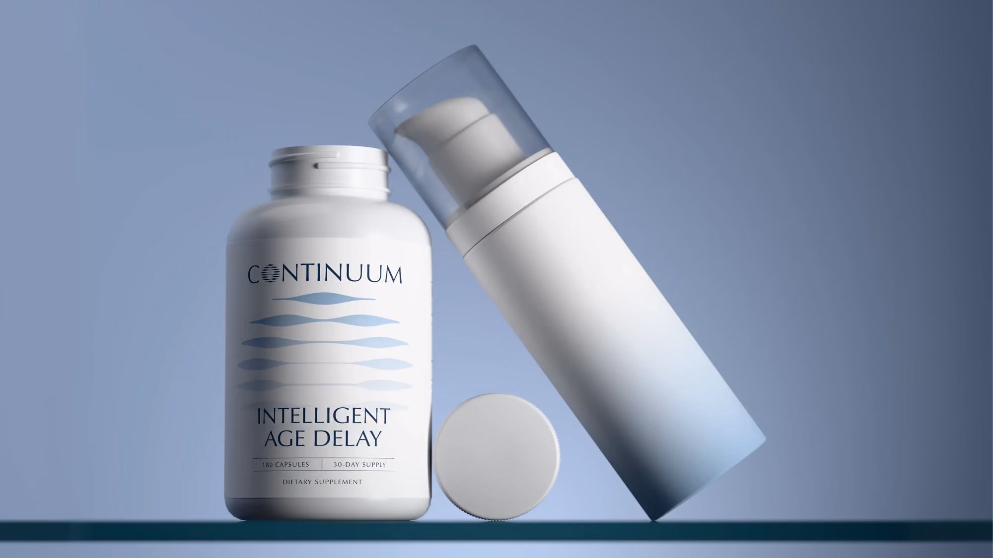
The aesthetic is changing
This is where most new creatine brands stumble. They inherit the visual language of the old category — black tubs, chrome type, explosive graphics, a tone that assumes the buyer is a 22-year-old man trying to add ten pounds to his bench.
But the person buying creatine in 2026 might be a 45-year-old woman who heard it helps preserve muscle, or someone adding it to their morning coffee for focus. That aesthetic doesn't just fail to attract them — it actively signals this isn't for you.
The brands capturing the new audience look completely different: cleaner, calmer, more wellness than warzone. They borrow from skincare and premium food more than from sports nutrition. The shift isn't cosmetic — it's a repositioning, and it's happening through design before it happens anywhere else.
What this means if you're launching
If you're entering creatine right now, the opportunity is real but the bar has moved. You can't win on the formula, and you can't win by looking like the brand next to you on the shelf. You win by being unmistakably clear about who you're for — and expressing that through a brand, packaging, and buying experience that all say the same thing.
That's a positioning problem first and a design problem immediately after. Who is this for? What do they already trust the look of? How does the tub, the site, and the product photography all reinforce one coherent answer? Get that right, and a commodity ingredient becomes a brand people specifically reach for.
Creatine going mainstream is a gift to anyone willing to treat branding as seriously as the category now demands. The molecule is settled. The market is wide open. The difference will be made in design.
Have a project in mind?
Tell us what you're making. Half-formed idea, full-blown launch, or somewhere in between — we're happy to talk it through.