High-Converting Product Page Design: What Separates Pages That Sell From Pages That Sit
A high-converting product page isn't a checklist of tactics. It's the brand system, carried through to the moment someone decides to buy.

What actually makes a product page convert?
A product page converts when it removes doubt faster than the next tab a shopper has open, not when it collects more conversion tactics. Search "product page design" and you'll find the same list everywhere: sticky add-to-cart buttons, urgency banners, trust badges, a quiz to guide people to the right SKU. None of it is wrong. All of it is downstream of a decision nobody's making: what does this brand actually look and sound like, and does this page match it?
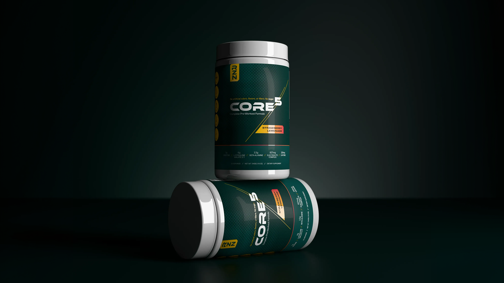
That's the piece most guides skip. They treat the product page as its own project, isolated from the packaging on the shelf or the identity system behind the logo. For a CPG or supplement brand, that's backwards. The page is one more surface in a system a customer is already forming an opinion about.
The page is downstream of the brand, not a separate project
If someone has seen the product in a store, on Instagram, or in a friend's cabinet before they land on the page, the page's job is recognition, not introduction. Same typography, same color logic, same photography style the packaging already established. When a page breaks from that system (stock photography that doesn't match the label, a font that isn't in the brand's type stack, layout habits borrowed from a template instead of the identity), it reads as a second, less-considered version of the brand. Shoppers notice inconsistency even when they can't name it.
This is where a system-first approach pays off before a single word of product copy gets written. A brand built with packaging, identity, and web as one connected system doesn't need a separate "make the product page trustworthy" initiative. The consistency is already doing that work.
What actually builds trust on a product page?
Trust comes from specificity, not decoration. A badge that says "clinically studied" does less than a line that names the study, the dose, and the outcome. "300mg citrulline malate per serving" tells a shopper something they can check. "Premium ingredients" tells them nothing. The same logic applies to photography: a render or photo that shows the actual product, at the actual size, doing the actual thing, earns more confidence than a lifestyle shot that could belong to any brand in the category.
Reviews and certifications only work if the page already looks credible
Star ratings and third-party seals are reinforcement, not a substitute for a well-built page. Layered onto a page with inconsistent spacing, mismatched imagery, or vague claims, they read as decoration on top of a problem. Placed near the specific claim they support, on a page that already looks considered, they close the last bit of hesitation. Sequence matters here: proof works best when it shows up right where a shopper's doubt would naturally surface, not stacked at the bottom as an afterthought.
Why do most pages default to tactics instead of judgment?
Because tactics are easier to install than a system is to build. A sticky button, a countdown timer, and a trust-badge row can go live in an afternoon. Rebuilding a page so its hierarchy, imagery, and claims actually match the brand takes real design judgment, and most teams reach for the checklist because it's faster, not because it's better. The result is a category full of product pages that all borrow the same tactics and end up looking, structurally, like the same page with different logos swapped in.
The brands that stand out aren't skipping the tactics. They're not starting there. A product page that grows out of a real brand system doesn't need to work as hard to earn trust, because the trust was already built one layer up, in the packaging and identity the shopper had already seen.
Have a project in mind?
Tell us what you're making. Half-formed idea, full-blown launch, or somewhere in between — we're happy to talk it through.