Supplement Packaging Design: How to Stay Compliant and Production-Ready
Good supplement packaging does two jobs at once — earn trust on a crowded shelf, and survive the realities of regulation and production.

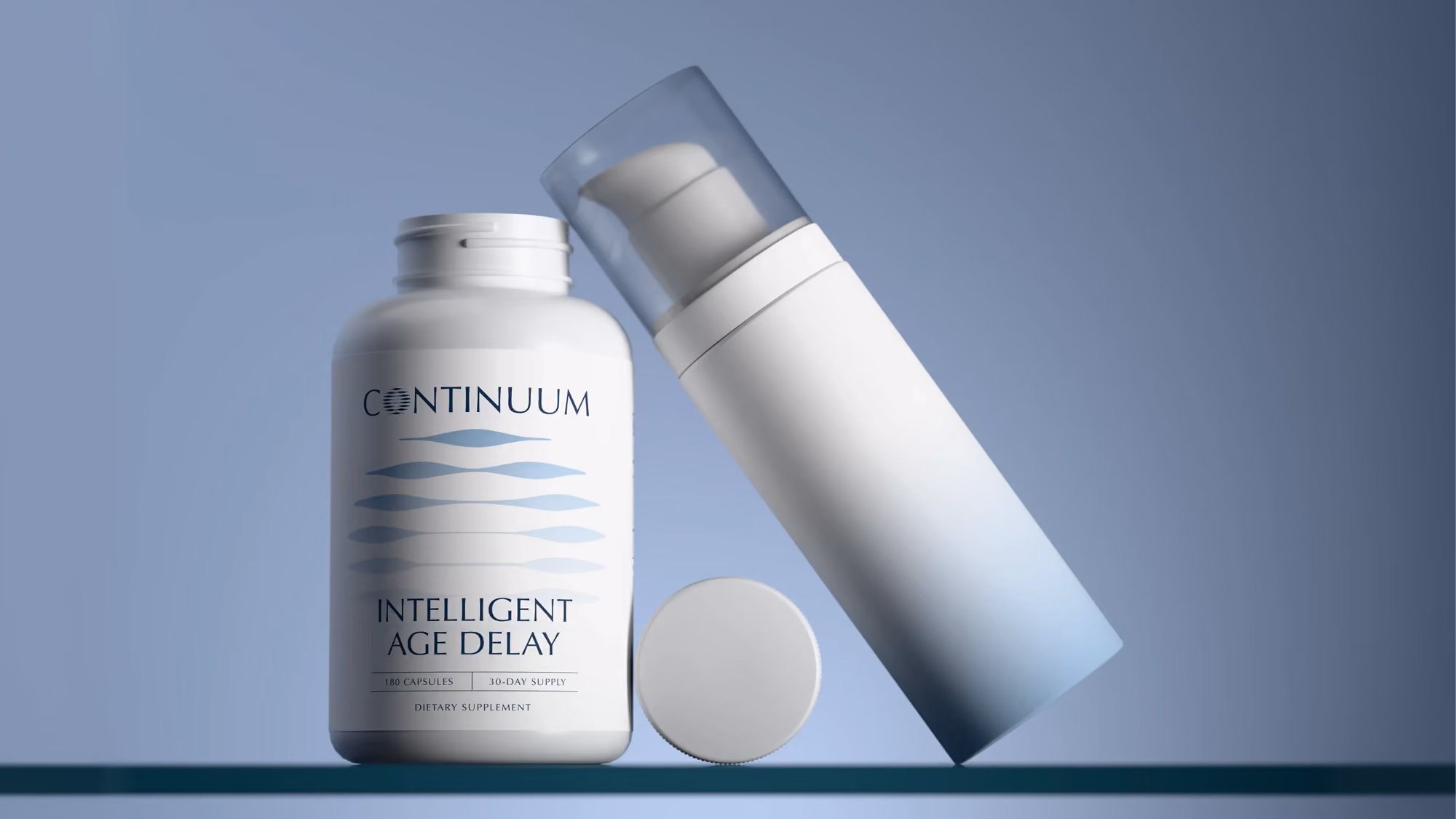
For a lot of supplement brands, the package is the first real thing a customer touches. It arrives on a doorstep, gets pulled from a shelf, sits on a counter for thirty days. Long before anyone judges the formula, they've judged the box. That makes packaging one of the highest-stakes decisions a new brand makes — and one of the easiest to get wrong.
The package is often the only physical brand experience
In a direct-to-consumer world, most of a brand lives on screens. The packaging is frequently the one tangible moment a customer has with you. If it feels cheap, flimsy, or generic, that impression transfers straight to the product inside — fairly or not.
Packaging designed as part of the brand system does the opposite. It quietly confirms the customer made a good choice, every single time they reach for it.
What compliant really requires
"Compliant" isn't a design flourish — it's the baseline that determines whether you can legally sell. For dietary supplements in the U.S., the design has to correctly accommodate several non-negotiables:
- A properly formatted Supplement Facts panel, with the right layout, serving sizes, and daily values
- A complete ingredient list and clear identification of allergens
- Required directions, warnings, and disclaimers, placed where they're actually legible
- Accurate net quantity, manufacturer information, and any claim language vetted against the rules
Designers who don't work in this space tend to treat these as things to squeeze in at the end. In practice, they shape the layout from the start. A label designed around its compliance requirements looks intentional. One that bolts them on last always looks crowded.
What production-ready means
A beautiful design the printer can't run is worthless. Production-ready means the files are built for how the package is actually made — correct dieline, bleeds, color specs, and finishes the manufacturer can reproduce.
It also means designing within real constraints: the substrate, the print method, the way a foil or matte finish behaves on the material you've chosen. Getting this right early is what prevents the expensive, momentum-killing surprises that tend to surface the week before launch.
Designing for shelf and screen at once
Supplement packaging now has to perform in two places: physically, in hand or on a shelf, and digitally, as a thumbnail on a product page or marketplace listing. A design that only works at full size fails the moment it's scaled down to a search result.
Strong packaging stays legible and recognizable at both extremes — bold enough to hold a shelf, clear enough to read at thumbnail size. Designing for both from the outset is what keeps a product looking like itself everywhere it shows up.
Have a project in mind?
Tell us what you're making. Half-formed idea, full-blown launch, or somewhere in between — we're happy to talk it through.