What a Wellness Brand Needs Before Launch: A Design Readiness Checklist
Before a wellness brand launches, four design pieces need to work as one system: identity, packaging, site, and product visuals.

Most wellness launch checklists stop at the product
Search "wellness brand launch checklist" and you'll find good advice on formulation, sourcing, niche selection, and margin math, whether the product is a supplement, a skincare line, or a functional food. What you won't find much of is the other half: what the brand actually needs to look, read, and function like before a customer meets it. That gap is where a lot of founders lose momentum. The product is finished and the packaging is printed, but the brand still feels like four separate vendors bolted together instead of one thing.
A wellness brand is launch-ready when identity, packaging, the site, and product visuals are built as one connected system, not four assets designed in isolation and hoping to match. Here's what each piece needs before launch day, and why the order they get built in matters as much as the pieces themselves.
Identity comes first because everything else depends on it
Before packaging design even starts, the brand needs a locked identity system: logo, color palette, typography, and a point of view on who this is for and why. Not a mood board. A usable system with rules attached, so the next hundred decisions (a new product, a retail one-pager, an Instagram carousel) have something to check against instead of getting reinvented from scratch.
This is also where positioning gets decided, and it has to happen here, not later. "Recovery support for endurance athletes" gives a designer something to build toward. "General wellness" doesn't. Wellness as a category is crowded precisely because so many brands skip this step; if the identity work skips positioning, the packaging and site inherit that vagueness, and no amount of good typography fixes a brand that hasn't decided who it's for.
Packaging has to do two jobs the copy alone can't
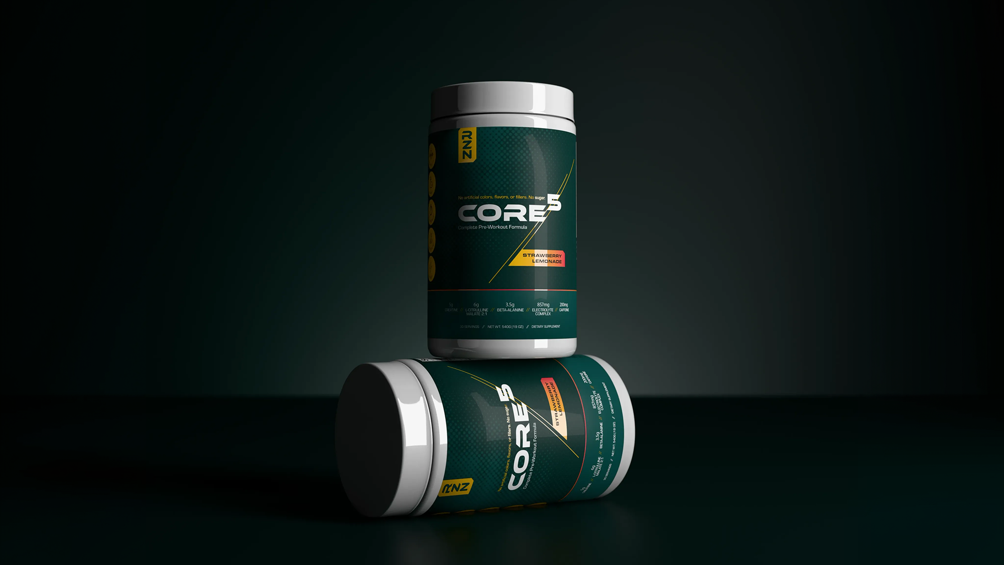
Packaging is the one surface where design and category requirements sit in the same square inch. Ingredient lists, usage instructions, and any regulated claims language are non-negotiable and specific to the product type, whether that's a supplement label, a skincare box, or a food package. Everything around them, the front-of-pack hierarchy, the color story, how the product reads on a shelf next to five competitors, is where the brand either earns trust or gets mistaken for a private-label afterthought.
What needs to be locked before print
Final artwork, ready for a printer, requires all required label information finalized with the manufacturer or formulator, claims reviewed against what the brand can actually substantiate, and a design system that scales across every product and size in the line, not just the hero item. Building one piece of packaging well and improvising the rest is a common shortcut that shows up fast once a second product or format ships.
What the site needs to do before a single ad runs
A wellness site's job before launch isn't to be beautiful. It's to remove friction between a curious visitor and a confident purchase. That means product pages that answer the real objections (what's in it, why it works, who it's for, how it compares) before the visitor has to ask, a checkout that doesn't add steps, and page copy that stays inside whatever regulatory guardrails apply to the category, since claims that are fine on a label can still get a brand in trouble in ad copy or on-page text.
The site should also carry the same visual system as the packaging. If a customer sees the product on a shelf, then looks it up, the site should feel like the same brand, not a different one wearing the same logo.
Product visuals aren't a nice-to-have for launch day
Photoreal renders and lifestyle imagery need to exist before launch, not get scrambled together the week of. They're doing real work: the hero shot on the homepage, the marketplace primary image, the paid social creative, the retail sell sheet. Building these off the same identity and packaging system, instead of a rushed photo shoot after the fact, is what keeps a brand looking finished on every channel it shows up on simultaneously.
What if you can't build all four at once
Most first-time founders can't fund a full system on day one, and that's fine. The sequence that holds up best: lock identity first, since packaging and site both depend on it, then packaging (it usually has the longest lead time and the most fixed requirements), then the site, then visuals, which can be built in parallel with packaging once the identity system is settled. What doesn't work is designing a logo, printing packaging, then hiring a different freelancer for the site months later. Each handoff is a chance for the system to quietly drift apart.
The checklist is really one question
Every item on this list, the packaging hierarchy, the product page copy, the render for the ad, comes back to the same test: does it look like it belongs to the same brand as everything else? A wellness brand that passes that test on day one starts with more credibility than one still stitching itself together six months in.
Have a project in mind?
Tell us what you're making. Half-formed idea, full-blown launch, or somewhere in between — we're happy to talk it through.