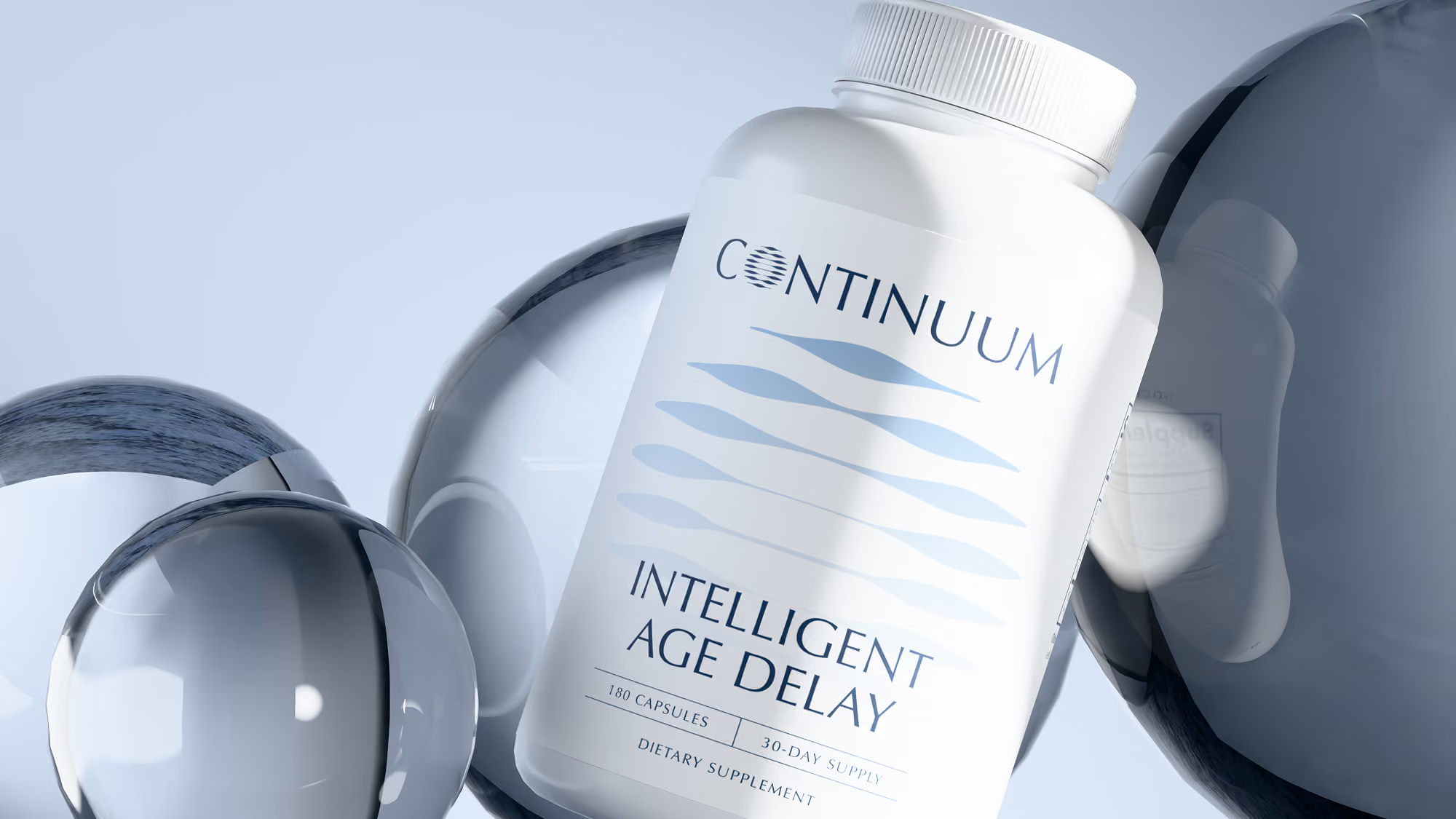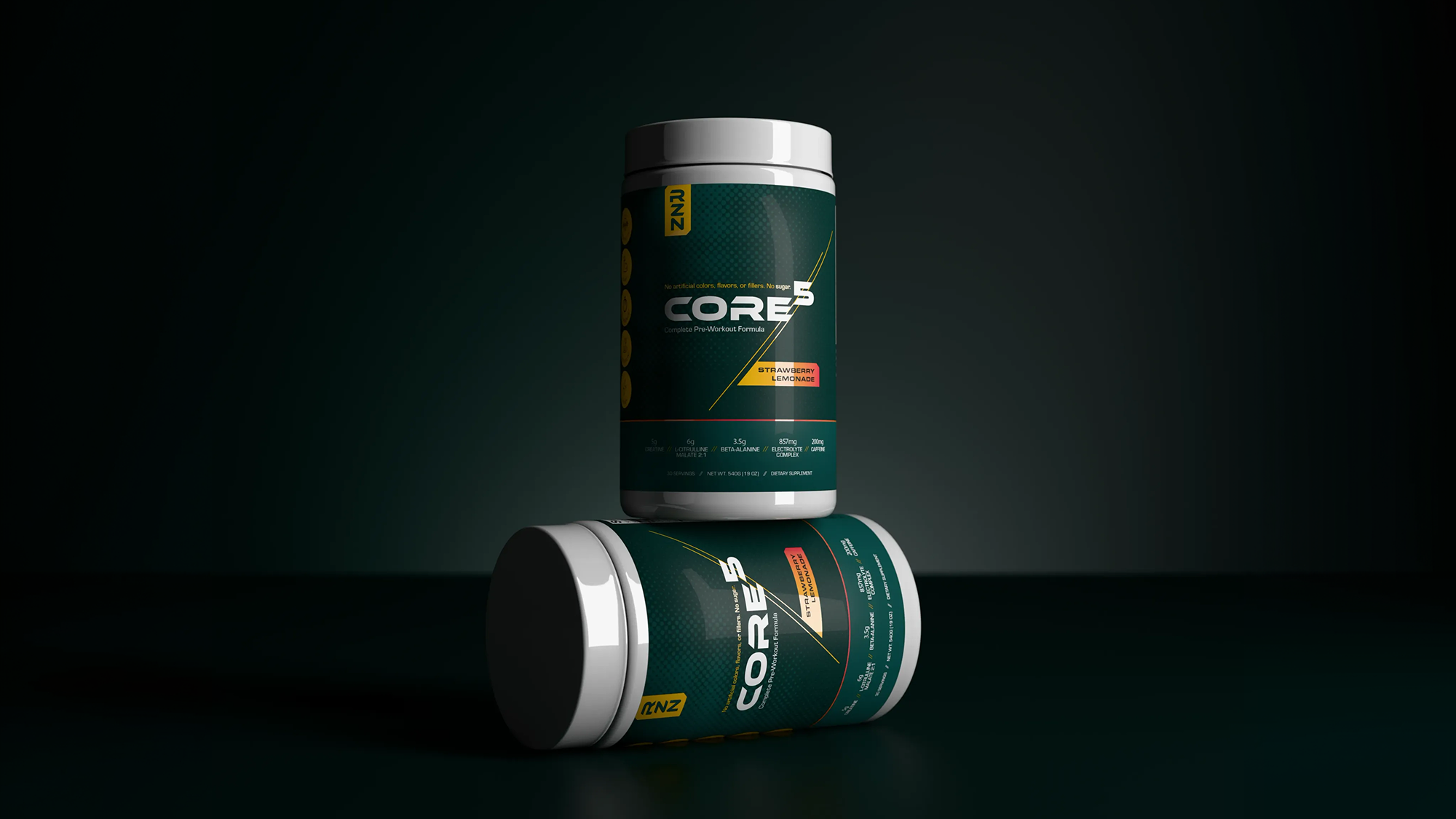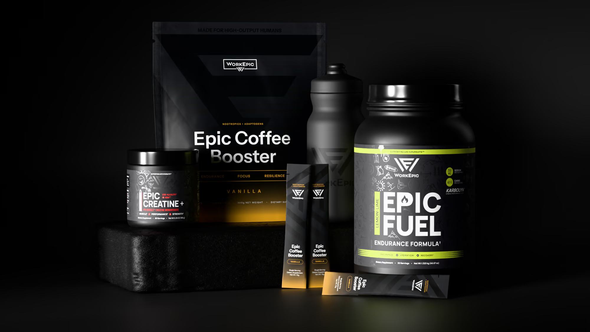
What is supplement packaging design?
Supplement packaging design is the work of turning a formula into a container, label, and information system that sells the product, explains it, and meets FDA labeling rules. Most guides on the topic treat it as a style question: bold colors for sports nutrition, earthy tones for herbals. Style matters. But packaging that holds up over time is packaging that was designed as a system from the start, with every panel doing a specific job.
That job splits three ways. A supplement label has to win on a shelf, survive as a small image on a screen, and stay compliant. When packaging fails, it's usually because it was designed for only one of the three.
What has to be on a supplement label?
Every dietary supplement label needs five required statements: the statement of identity, the net quantity of contents, the Supplement Facts panel, the ingredient list, and the name and place of business of the manufacturer, packer, or distributor. They live on two panels. The principal display panel (PDP) is the front, the side shoppers see first. The information panel sits immediately to its right.
The rules get specific. FDA guidance calls for the net quantity statement to appear as a distinct item in the bottom 30% of the PDP, parallel to the base, with a minimum type size tied to the panel's area. The Supplement Facts panel has its own formatting requirements. If the label makes a structure/function claim like "supports joint health," it also needs the FDA disclaimer.
None of this is optional, and it's why we don't use AI to design supplement labels. A tool can generate something that looks like a Supplement Facts panel. It can't tell you whether it's right, and a wrong one is a reprint at best.
How do you make supplement packaging stand out on shelf?
Shelf presence comes from hierarchy more than color. A shopper scanning a wall of tubs gives each one a second or two, and in that window they need to catch three things in order: what it is, who makes it, and why it's different. A front panel that tries to say eight things at once ends up saying none of them.
The strongest supplement packaging makes one decision and commits to it. That might be a single dominant product name, or a color nobody else in the category owns. Restraint reads as confidence, and in a category where trust is most of the sale, confidence is worth more than volume.
Designing supplement labels for the screen, not just the shelf
For many supplement brands, a customer's first look at the package isn't in a store. It's a thumbnail in an Amazon grid, a product card on a Shopify collection page, or a frame in a paid social ad. At that size, fine print disappears and small badges turn into noise.
So test the label small. Shrink the front panel to the size of a search result and check whether the product type and brand still read. If they don't, the shelf version probably isn't as clear as you think either. This is also where product renders earn their place. A real 3D model of the package lets you check the label on the actual container shape before anything goes to print, and it gives the site and ads consistent imagery from launch day.
Packaging is a system, not a single SKU
A label isn't finished when the first product ships. It's finished when the second, third, and tenth product can use the same structure without a redesign. That means deciding early how flavors, formulas, and sizes will be told apart (color, a numbering system, a secondary name), where those cues live on every panel, and how the layout flexes when a Supplement Facts panel doubles in length.
Brands that skip this step end up with a product line that looks like it came from five different companies. Brands that plan for it get packaging where every new launch looks like it belonged all along.
The label is the one piece of your brand every customer holds in their hands. It should be built like the rest of the system depends on it, because it does.