Brand Identity Design for Wellness Brands: What a Real System Includes Beyond the Logo
Brand identity design goes well beyond a logo. Here's what a real identity system includes for a wellness brand, and how it holds up on packaging, web, and ads.
What is a brand identity system?
A brand identity system is the full set of visual parts a brand uses, plus the rules for how they work together: the logo and its variations, color, typography, graphic elements, imagery, and the guidelines that tie them to real surfaces. The logo is one piece of it. It's usually the piece founders think about first, and the one that does the least on its own.
A good mark does real work, but nobody picks a magnesium supplement off a shelf because of the logo alone. They pick it because the package, the product page, and the ad that brought them there all look like they came from the same careful company. That impression comes from the system around the mark.
Why a logo alone breaks down for wellness brands
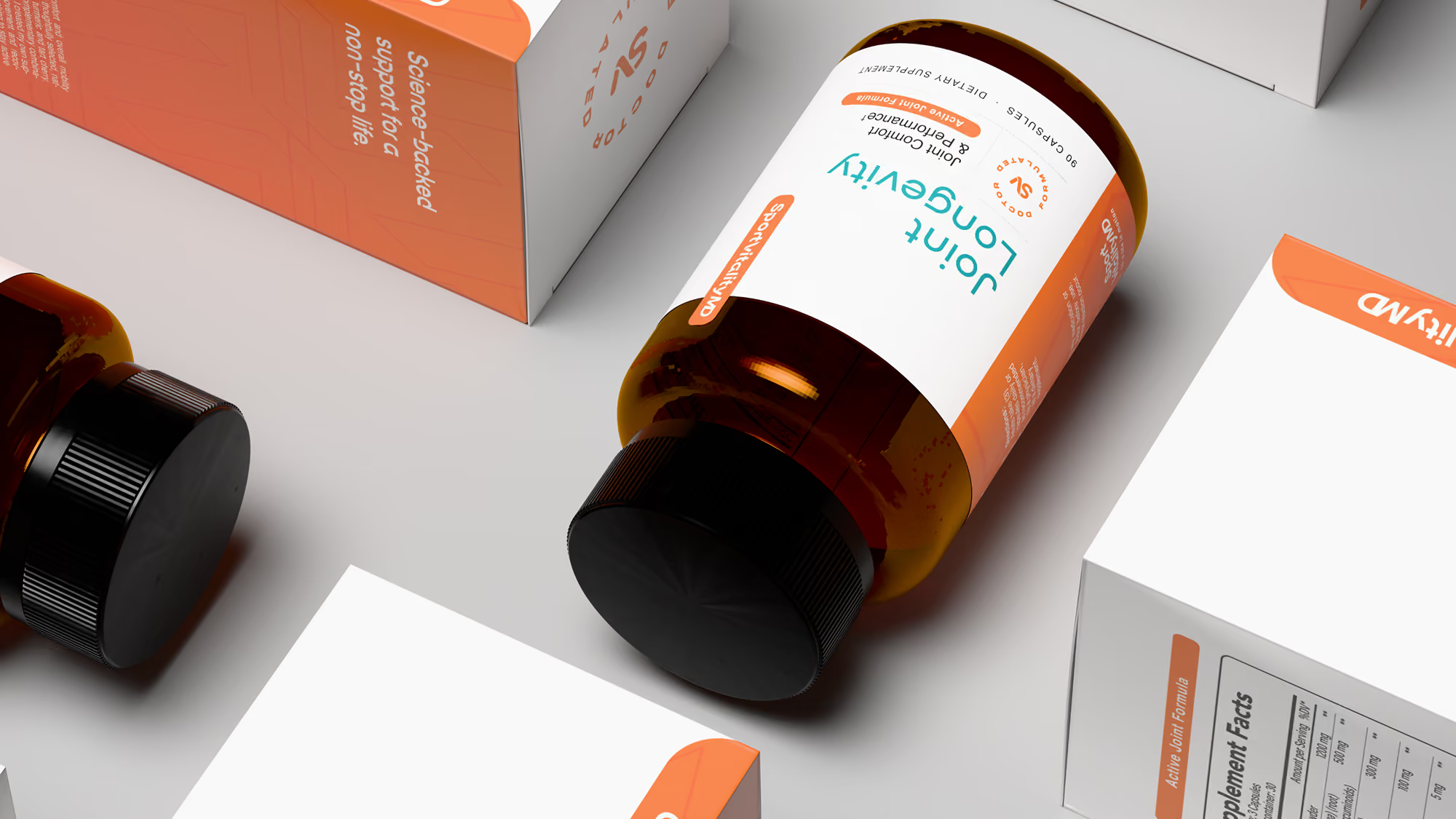
Wellness products live on more surfaces than most categories, and every surface asks something different of the brand. A 60-count bottle needs the name readable at arm's length. A stick pack gives you about an inch of width. A Shopify product page needs a hero, a benefits section, and a comparison chart. An Amazon thumbnail and a Meta ad get a second or two.
A logo delivered as a single file can't answer any of those questions. So they get answered one at a time, by whoever is on deadline: the label printer, the freelancer building the site, the founder making ads late at night. Each answer is reasonable on its own. Together they drift, and six months later the brand has three greens and two versions of its own name.
What a wellness brand identity system includes
A complete identity for a wellness brand covers four areas, each designed for real surfaces instead of a blank artboard.
A logo suite, not a logo
That means a primary lockup, a stacked version, a wordmark on its own, and a small mark that works as a favicon, a cap print, or a social avatar. Each one gets minimum sizes and clear-space rules, so it doesn't get squeezed onto a narrow label panel and quietly redrawn by someone else.
Color with a job
In wellness, color usually does two jobs at once. It carries the brand, and it codes the line by flavor, format, or benefit. A real system defines which colors stay fixed, which ones flex by SKU, and how each one reproduces in CMYK on a matte pouch versus RGB on a phone screen, where the same green can shift noticeably.
Typography that holds up at label size
Type gets tested hardest in the places nobody screenshots: supplement facts panels, ingredient lists, warnings, and mobile product pages. A typeface that looks great as a large headline can fall apart at six points. The system names a display face, a text face, and the rules for hierarchy, so compliance copy stays readable and the brand still sounds like itself.
Graphic language and imagery
This is what makes a brand recognizable with the logo covered: patterns, shapes, icon style, photo direction, and how product renders are lit and composed. It also keeps a new SKU or landing page from looking borrowed.
Holding all of it together are the guidelines. The useful kind shows each piece applied to real formats (a bottle, a pouch, a product page, an ad) instead of living in a style guide PDF nobody opens.
Is your brand identity a system or a folder of files?
If someone new to your brand could design the next SKU label or landing page without asking you twenty questions, you have a system. If every new piece starts with digging through old files and guessing, you have assets.
A few quick checks tell you which one you're working with. Does your logo have a version that still reads at favicon size? Do you know your brand green in CMYK, RGB, and hex, and do they actually match? Is there a rule for what changes between flavors and what never does? Could a customer tell your product from a competitor's with the logo taped over?
If most of those answers are no, the fix usually isn't a new logo. It's building the structure around the one you have, or redesigning the mark only if it truly can't carry the load. That's the work that makes a wellness brand look established on day one and still look like itself at SKU twenty.
The logo is what people remember. The system is what makes them trust it enough to buy.
Have a project in mind?
Tell us what you're making. Half-formed idea, full-blown launch, or somewhere in between — we're happy to talk it through.