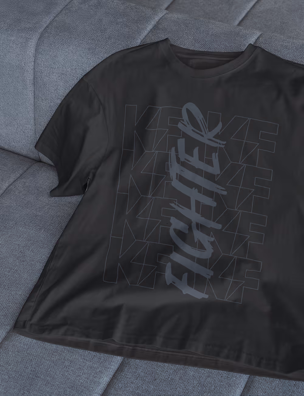
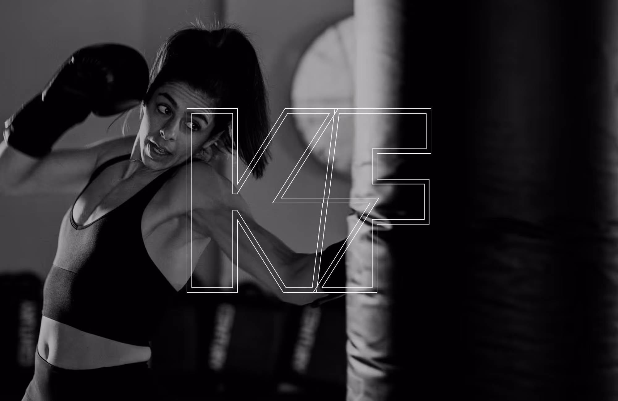
KickFIT
Bold without barriers
Client:
KickFIT
Year:
2025
Type:
Strategy
Creative direction
Branding
Web design
A high-energy rebrand for a kickboxing studio built for first-timers and fighters alike.
Project description
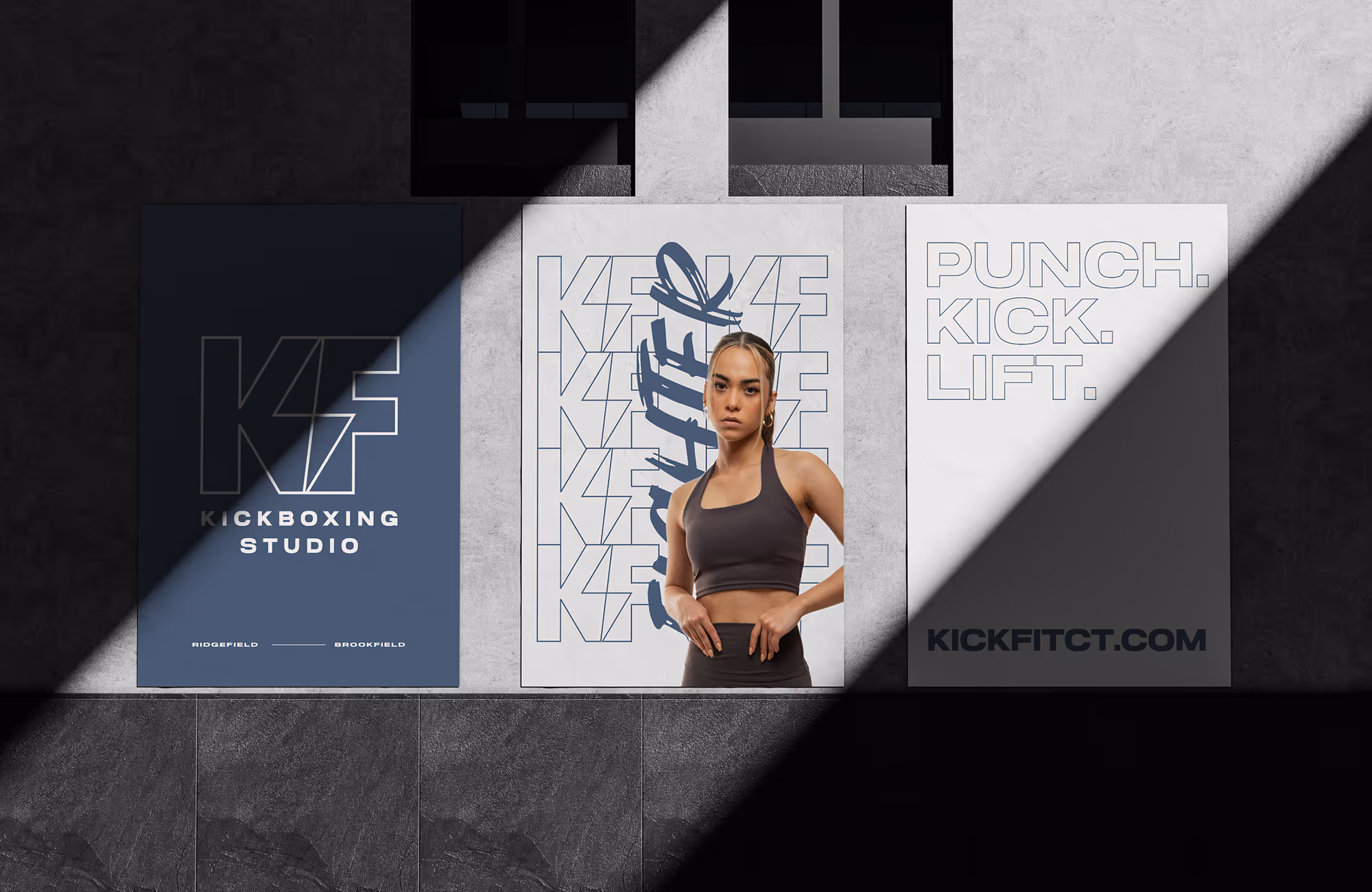
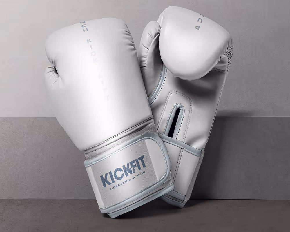
Most kickboxing brands force a choice. Lean hard into combat-sports aggression and you scare off the people who actually fill boutique fitness studios. Lean too far into the soft, boutique-fitness aesthetic and you lose credibility with the practitioners who care about the discipline itself. KickFit serves both — casual folks chasing a great workout and serious students treating it as a craft — and their dated identity wasn't holding either group well. The rebrand brief was to find a single visual voice that could carry intensity and approachability at once.
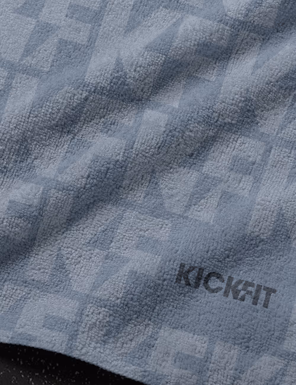
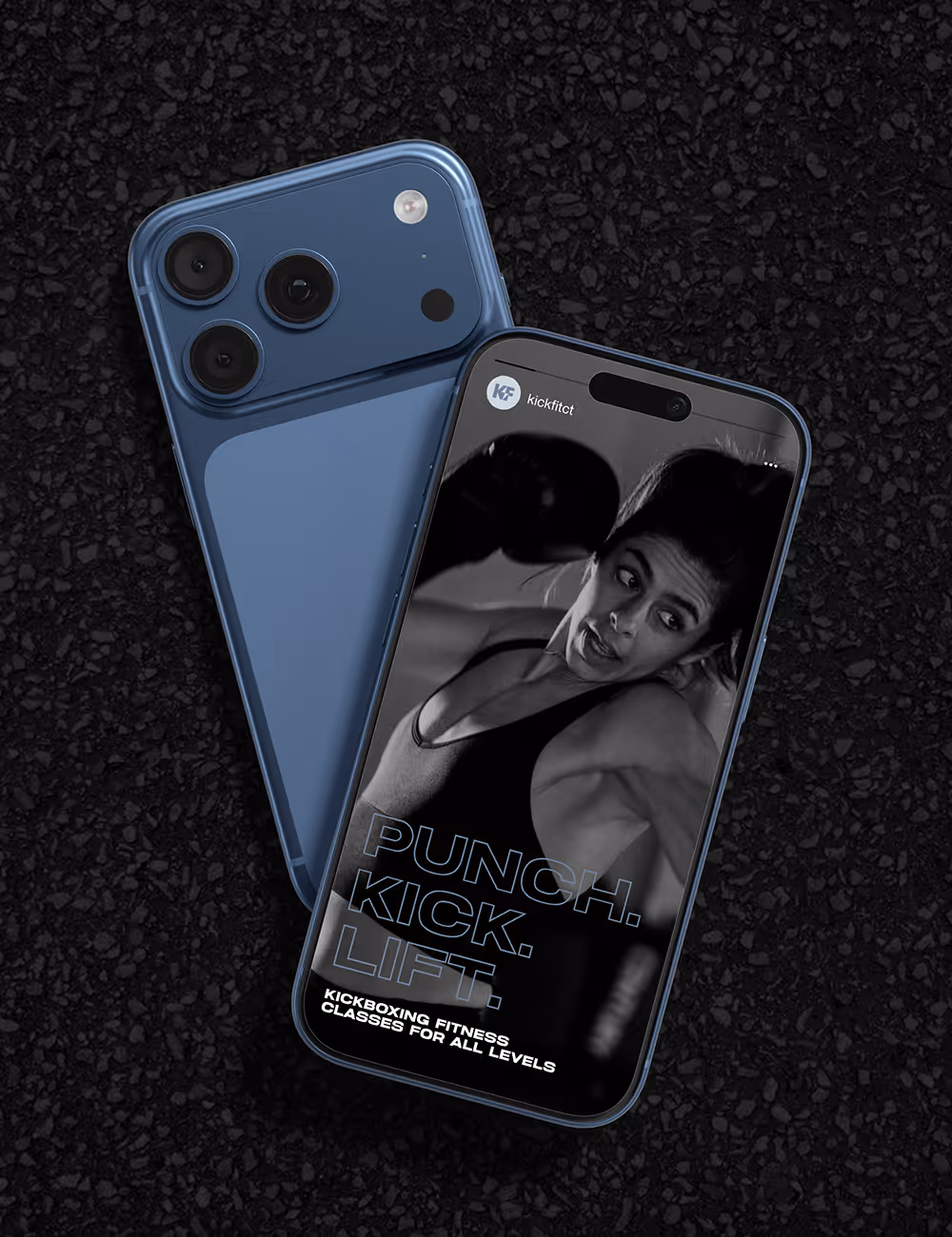
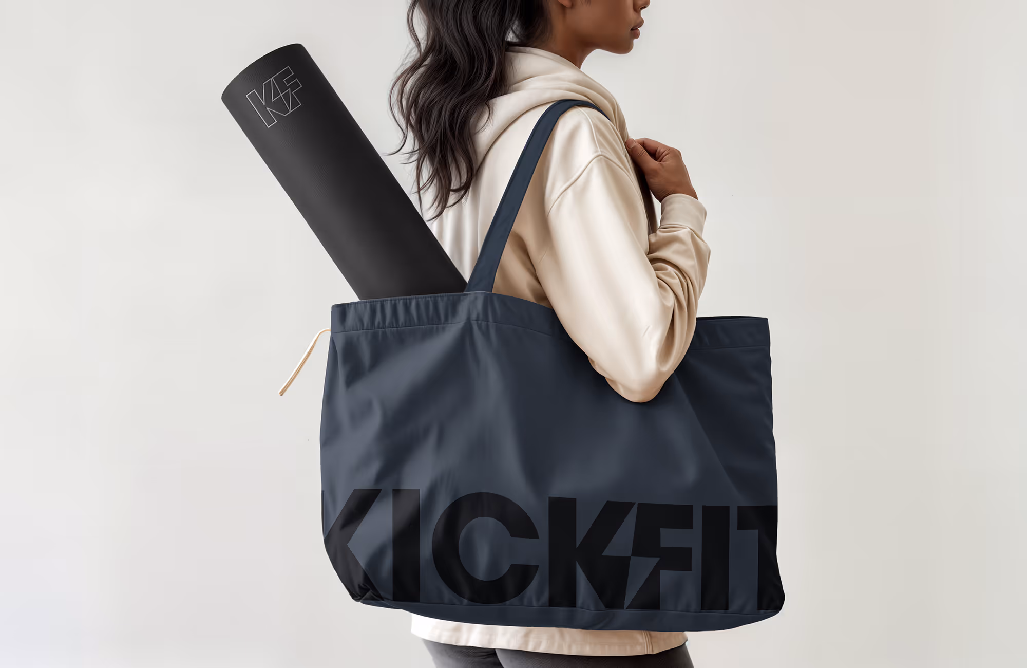
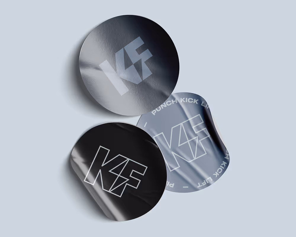
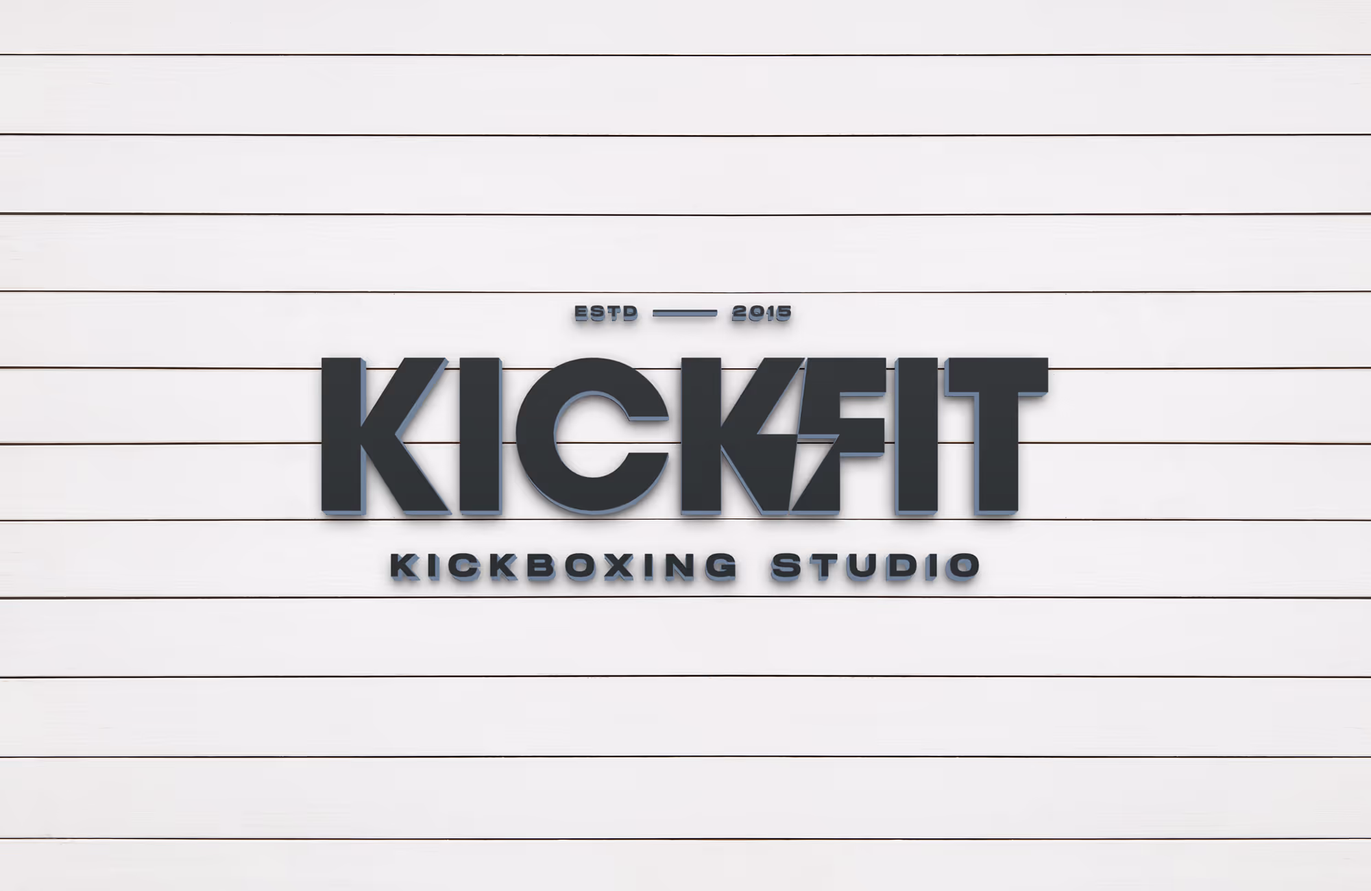
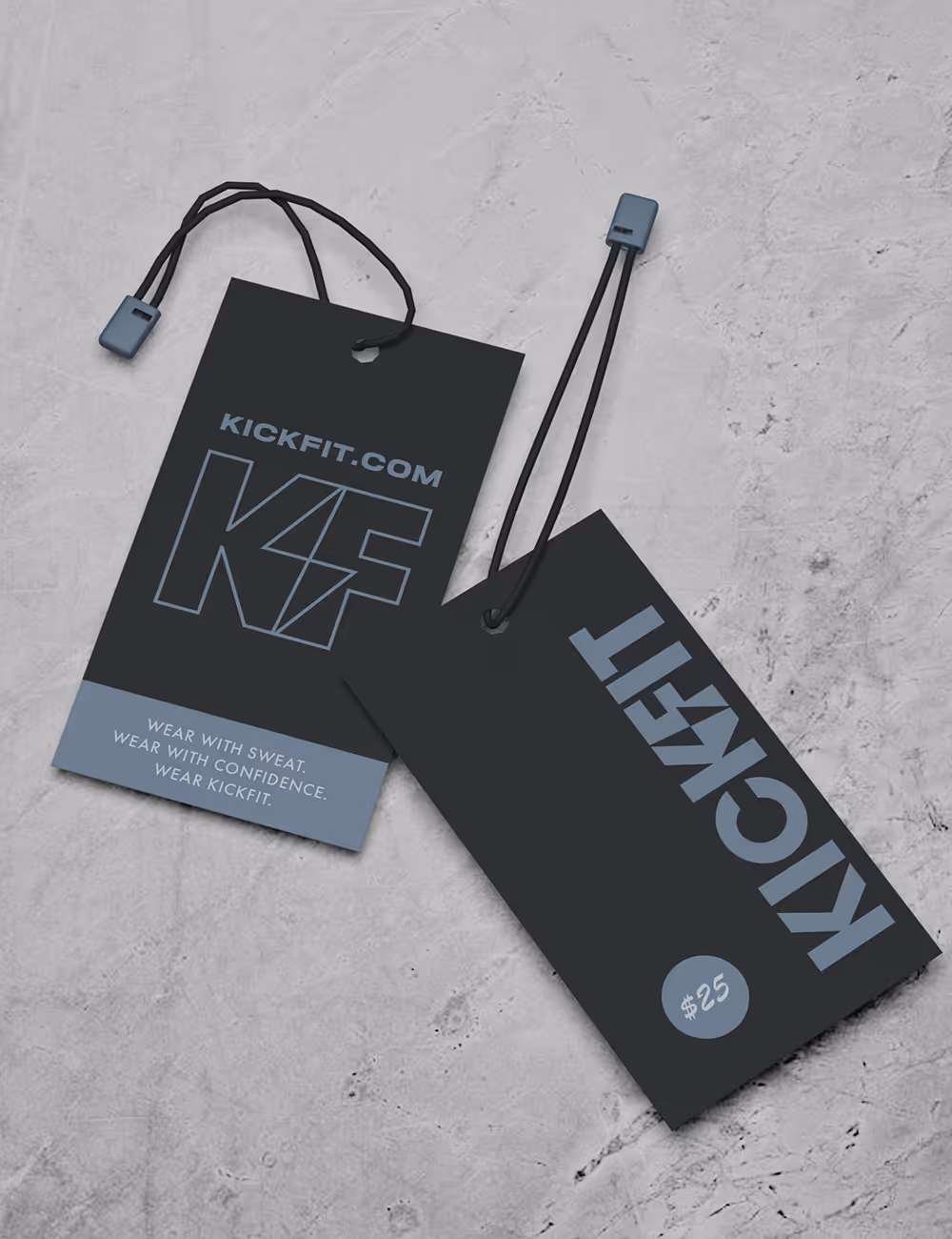
We built a brand that lands in the middle without going soft. A confident, kinetic identity — typography with structure, a palette that reads charged but not aggressive, and a visual system disciplined enough to feel serious without ever feeling exclusionary. The system carries across a new website, studio signage, and the day-to-day applications members actually interact with. The result is a brand that welcomes first-timers without losing serious practitioners — and signals to both that they're in the right place.


Have a project in mind?
Tell us what you're making. Half-formed idea, full-blown launch, or somewhere in between — we're happy to talk it through.