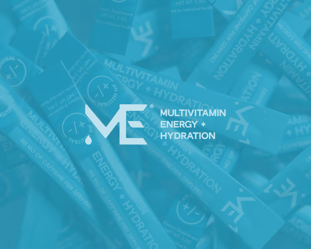
ME1
Energy reimagined
Client:
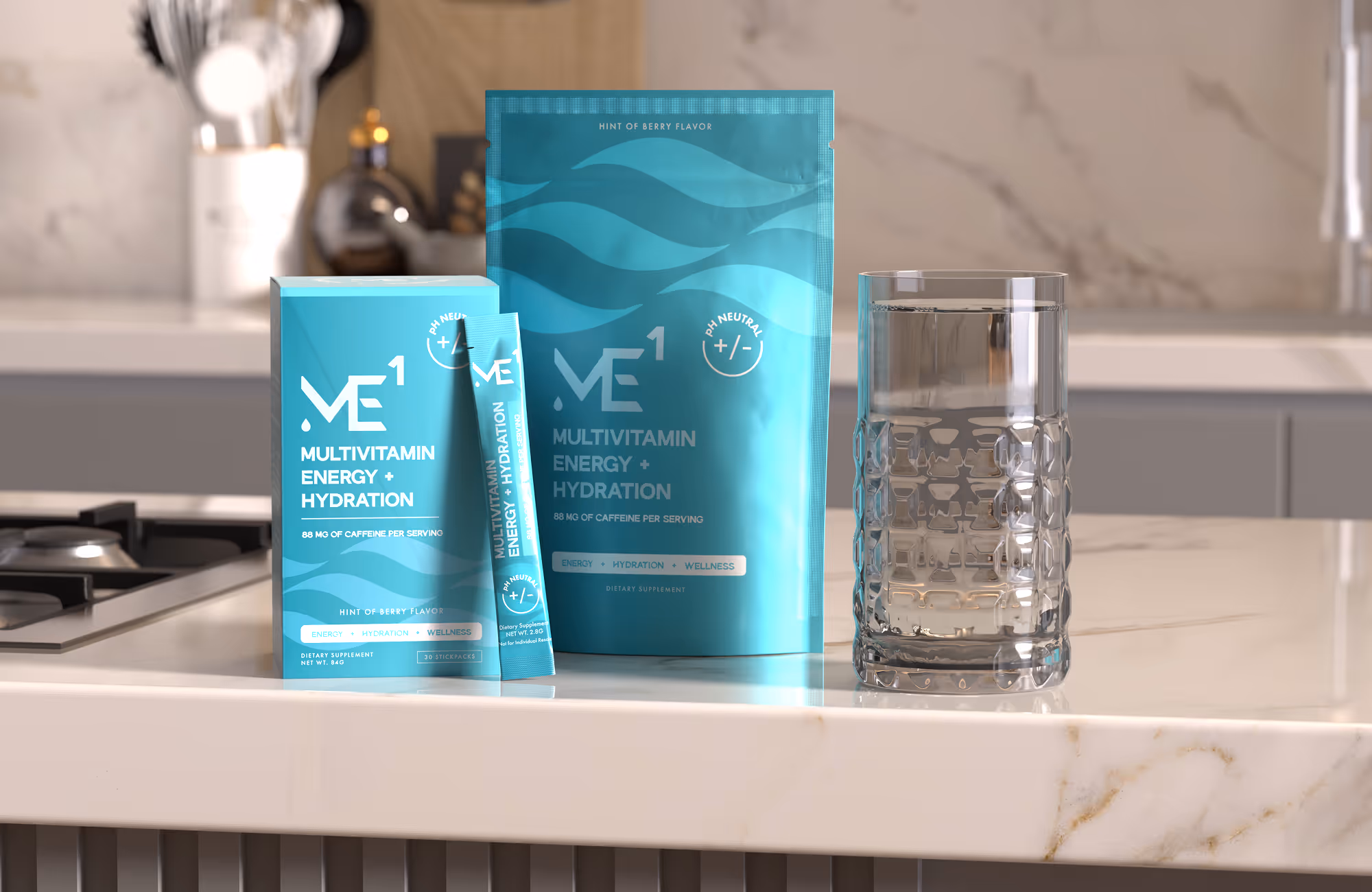
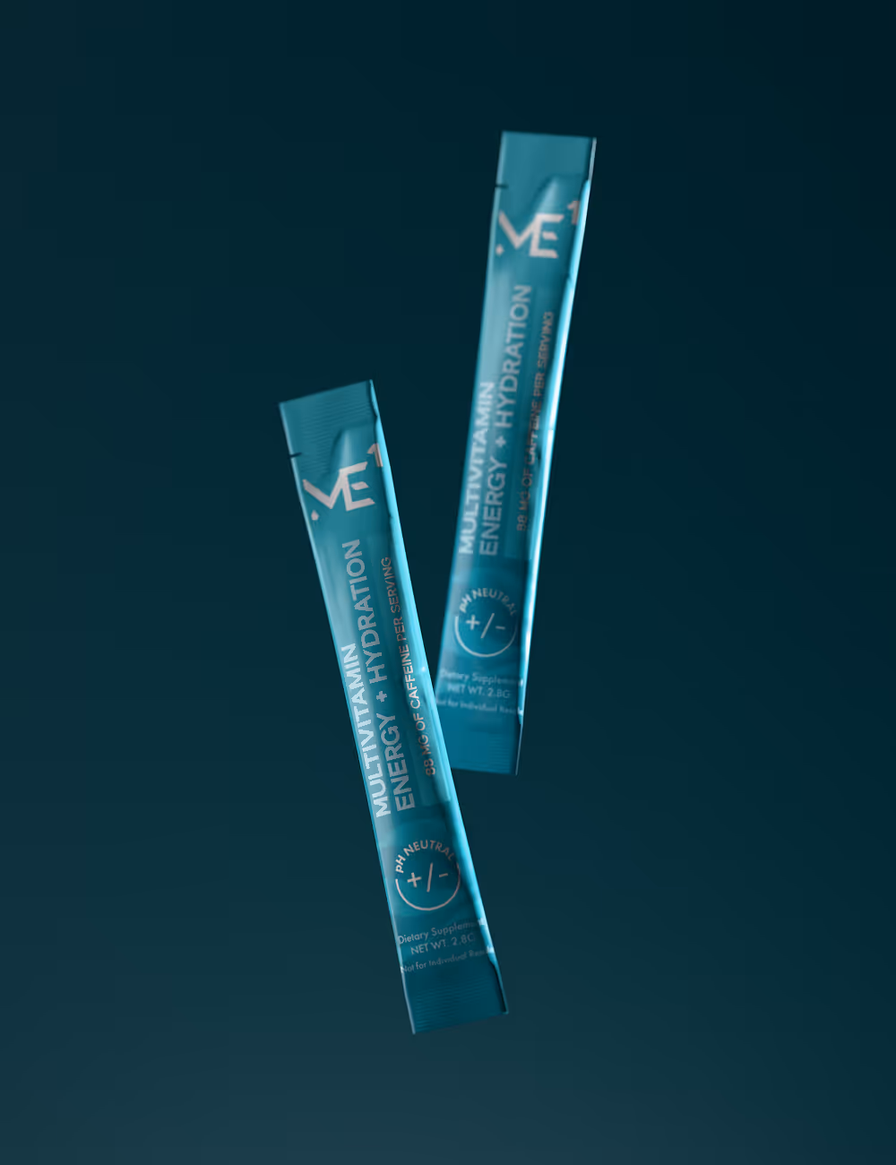
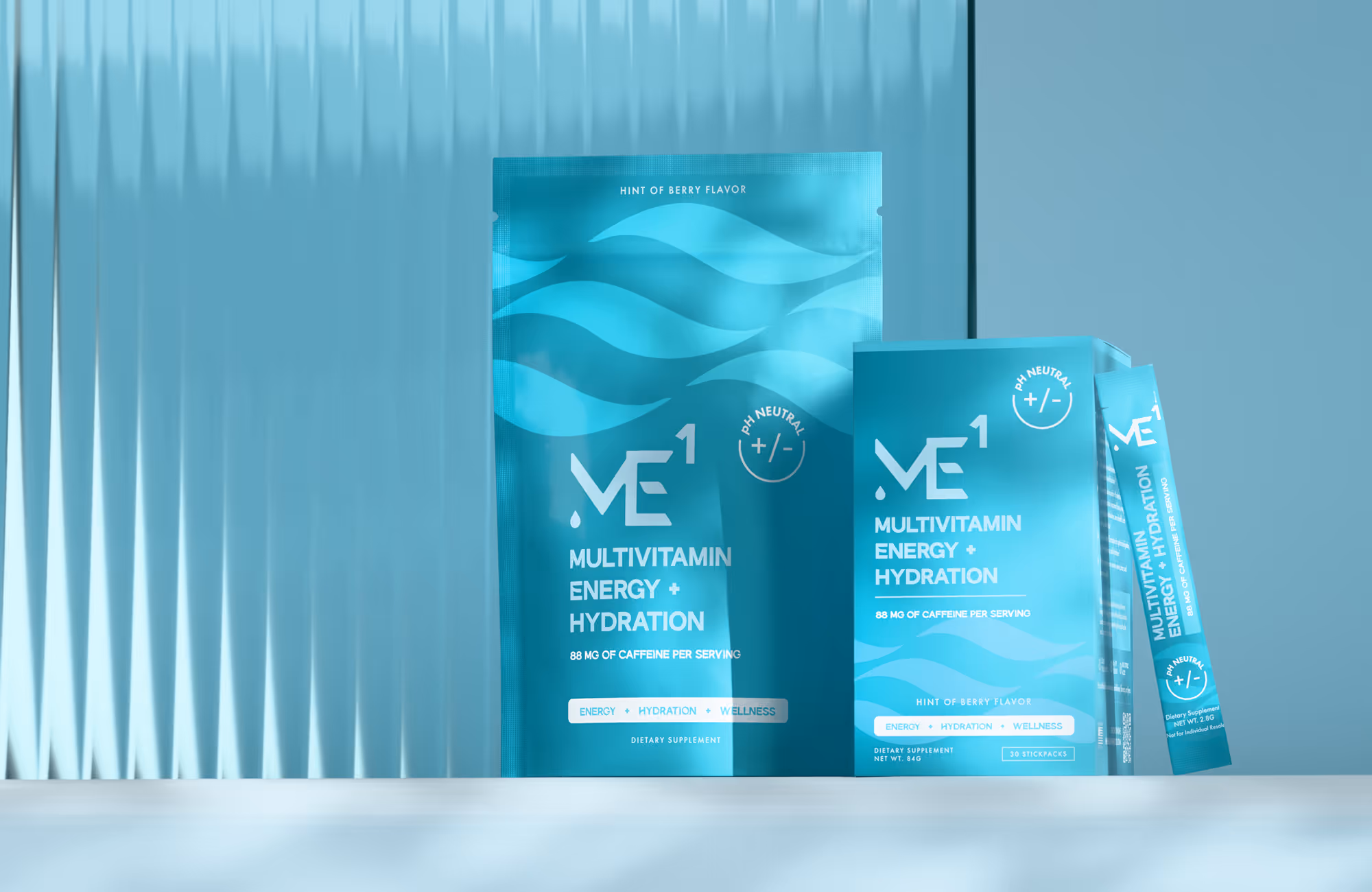
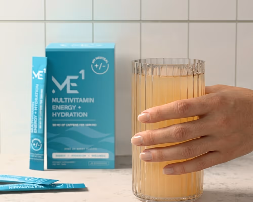
Multivitamin Energy + Hydration
Year:
2026
Type:
Strategy
Creative direction
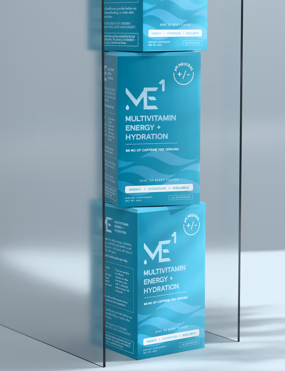
Branding
Packaging
Web design

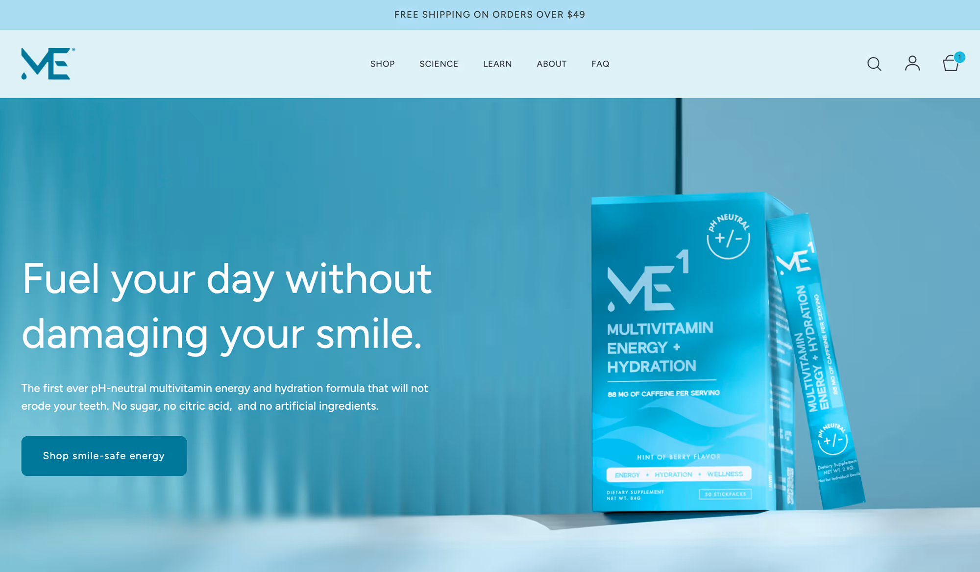
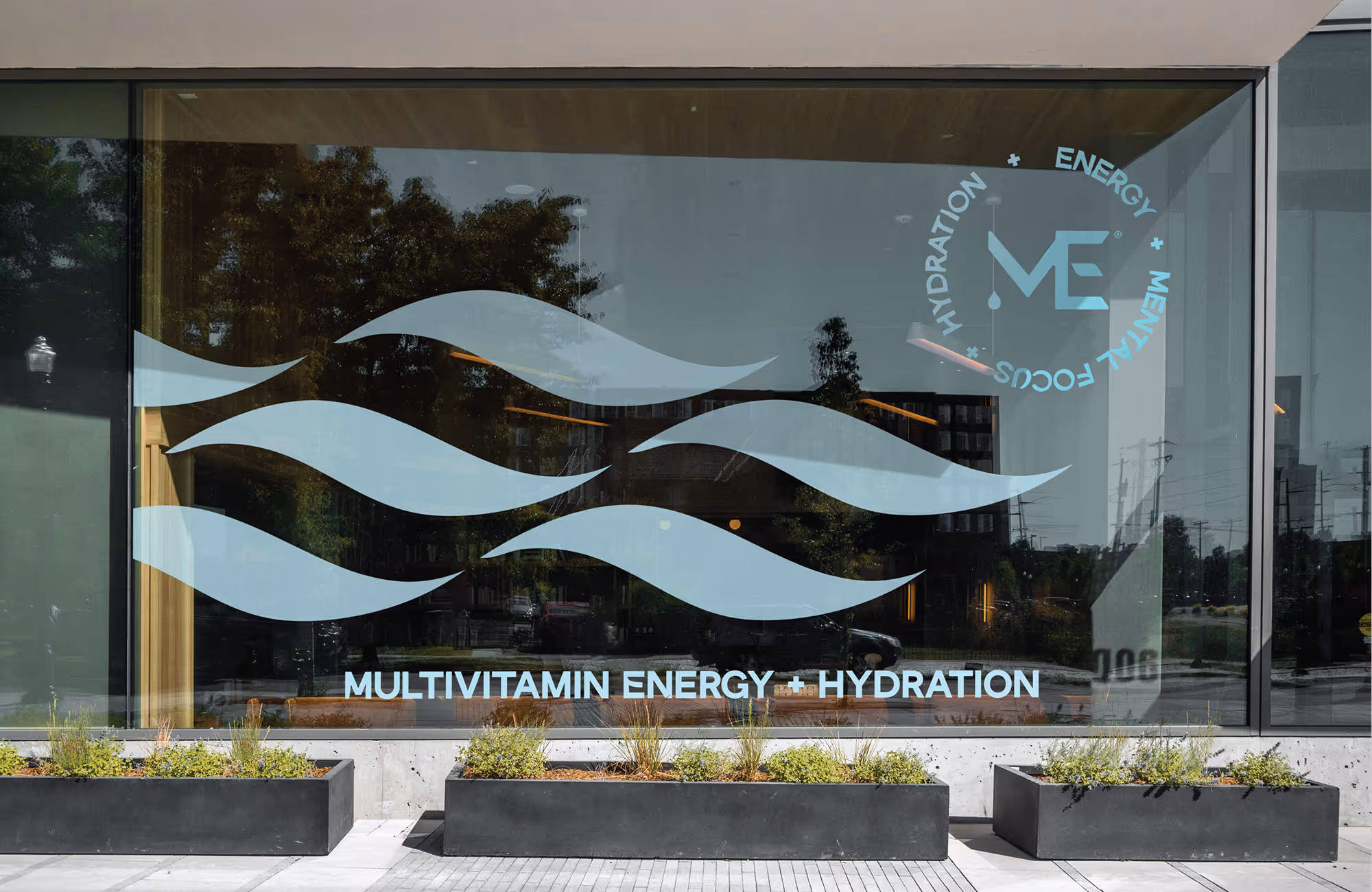
A precision-first system for an energy brand competing on care, not intensity.
Project description
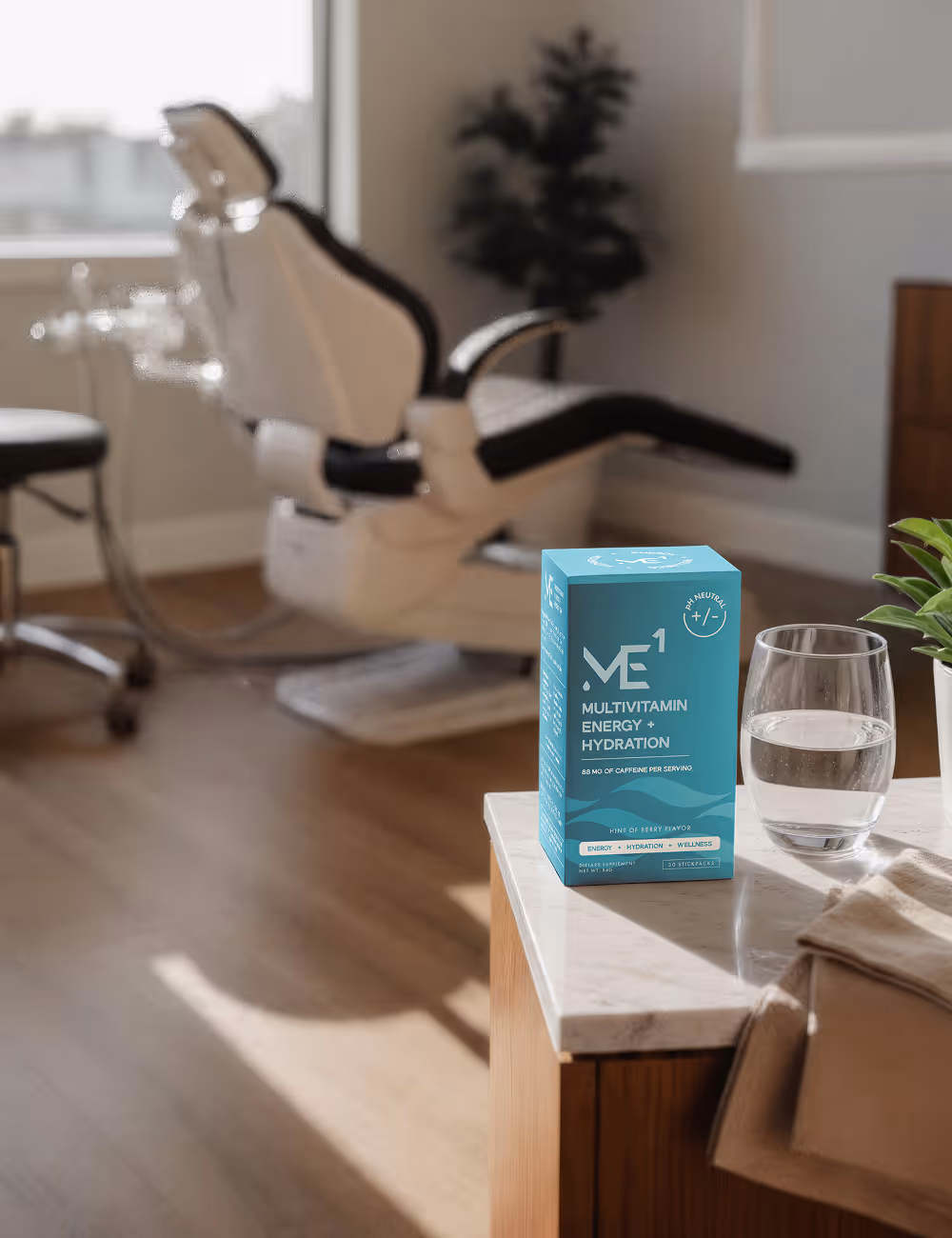
The energy and hydration category competes on intensity. Brighter colors, louder type, bigger numbers — more caffeine, more electrolytes, more flavor, more something. The arms race only goes one direction. ME1 saw a different opening. Their formula is pH-neutral, engineered to deliver energy and hydration without eroding tooth enamel — and for the people actually drinking these products every day, that's not a small detail. It's the difference between a product that helps you in the moment and damages you in the background, and one that respects the fact you're going to drink it again tomorrow.
The strategic move was to position ME1 on precision rather than intensity, and let the pH-neutral science do the proving. We built a full system — strategic positioning, identity, packaging, website, and product visuals — that reads modern and confident without ever crowding the shelf with noise. Clean typography, considered color, stick-pack design and retail signage built with the precision of something engineered rather than mixed. The result is a brand that competes by stepping out of the arms race entirely — built for the people who care what their daily habit is doing to them in the long run.
Have a project in mind?
Tell us what you're making. Half-formed idea, full-blown launch, or somewhere in between — we're happy to talk it through.